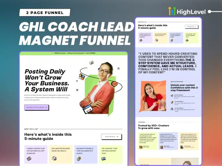
GoHighLevel Lead Magnet Funnel for Coaches
Most people don’t need a giant funnel. They just want to test if their offer even works.
So I stripped it down to what matters:
- A clean lead magnet page
- A simple thank you page
That’s it.
Just something you can launch fast and start collecting leads today.
If it works, great, I will add more pages later?
If you want more pages DM me and pay the difference. I’ll sort it out.
And If you haven’t got the funnel, you can grab it from here 👇
Let’s get your funnel live and growing your list.
Basic Setup
This funnel is fully built using the GHL (GoHighLevel) builder. Just some light custom CSS for polish, things like:
- Button shadows
- Dividers
- Cleaner alignment (GHL’s defaults needed a bit of help)
- Icons
Good news is you can edit everything right inside the builder.
If you’re okay with making a few small CSS tweaks, you’ll be totally fine.
And don’t worry, this doc walks you through every step.
Not comfortable with code? No problem. Just DM me, and I can help you edit it for a small one-time fee.
Before You Start Editing (Read This First)
Doesn’t matter which HighLevel funnel or website you bought from me, the basic setup steps are usually the same.
So before you jump into editing…
👉 Click here to read the universal setup guide
(It covers things like how to edit the CSS, common tweaks, tips and color changes)
Once you go through that, come back here for the funnel-specific tweaks.
Save yourself headaches. Trust me, it’ll make everything smoother.
Figma Assets
Note: You should have basic knowledge of Figma, how to edit, import, export, etc. If not, just watch a few tutorials on YouTube. It’s easy to learn.
Figma UI Design Tutorial – How To Redesign Any Website (A Beginner’s Guide)
Alright, I’ve added Figma design file for this funnel inside your PDF (the one you got after purchase), so you can easily edit and customize them to match your brand colors, logos, or content.
Here’s how to get started:
- Open the PDF and click the Figma file link
- Log in or sign up (don’t worry — it’s free)
- Click on the file name (top left corner) 👇
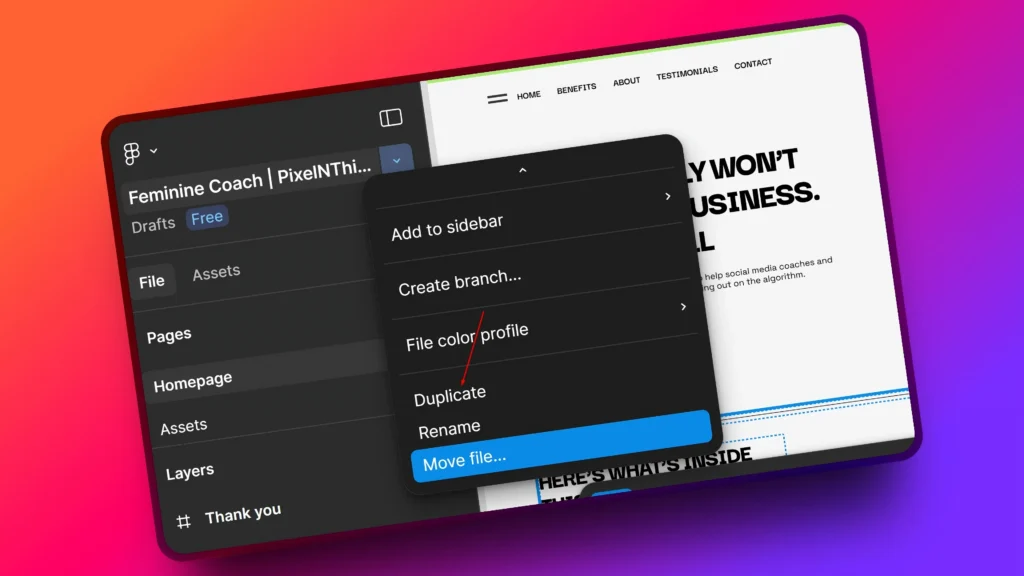
- Select “Duplicate” to your drafts
- Boom, now you’ll have your own copy to edit freely
Once it’s in your drafts, you can update images, icons, and colors however you like. Let me know if you need help editing it.
Editing the Lead Opt-in Page
Alright, let’s get into it.
By now, you should already:
- Have the Figma file duplicated and customized
- Gone through the Basic Setup Guide
- Know how to tweak basic CSS and use global styling inside GHL
So I’ll keep this part short and to the point, you only need CSS for a few visual touches.
The rest? Just use the builder.
Top Header
At the very top of your lead magnet page, you’ll see a sparkle icon beside the “FREE Download” message. This section uses the class: .sparkle-header
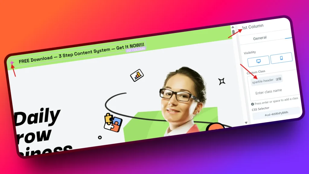
I’ve styled with a custom SVG icon, but feel free to replace it with any other icon that fits your brand.
You can find the CSS for this between lines 80 to 96 in your custom CSS tab:
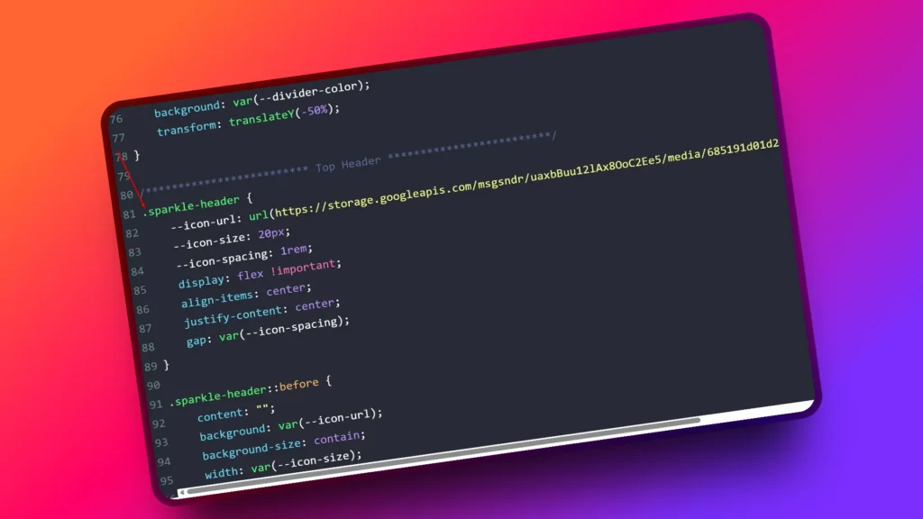
To Use a Different Icon:
- Upload your new SVG icon via GHL media library
- Hover on media file you just uploaded. Click the three dots (︙)
- Select “Get Link”
- Replace the
--icon-urlvalue in CSS with your new icon link
CSS
--icon-url: url(https://your-new-icon-link.svg);Done. You’ve got a new icon for your top bar.
Buttons
Every button element in this funnel uses two custom classes:
.px-cta-icon→ adds a custom SVG arrow icon
.px-box-shadow→ adds a soft button shadow
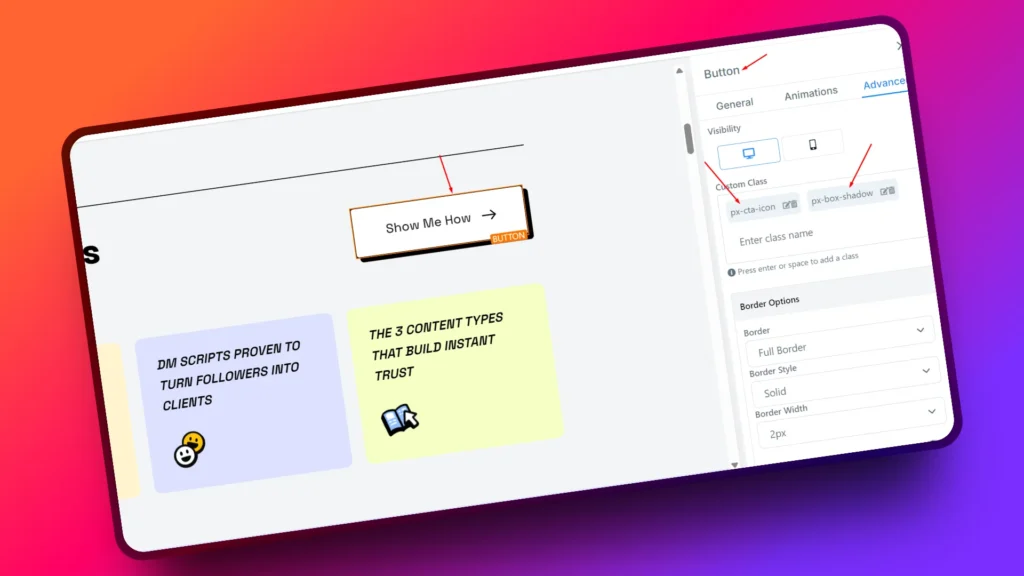
GHL’s default arrow icons looked outdated, so I replaced them with a modern SVG. You can keep it, replace it, or remove it if you prefer GHL’s default styles. Totally up to you.
How to Use
- Arrow Icon: Add
.px-cta-iconto any new button. To change or replace the icon, check lines 17 to 36 in the custom CSS tab 👇
- Button Shadow: Add
.px-box-shadowto give the button a subtle shadow effect . You’ll find the shadow code also on lines 38 to 52 👇
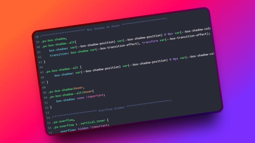
- One thing to note Footer CTA button uses
.px-box-shadow--alt

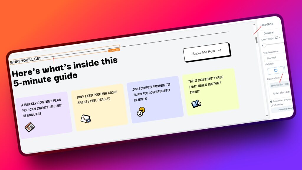
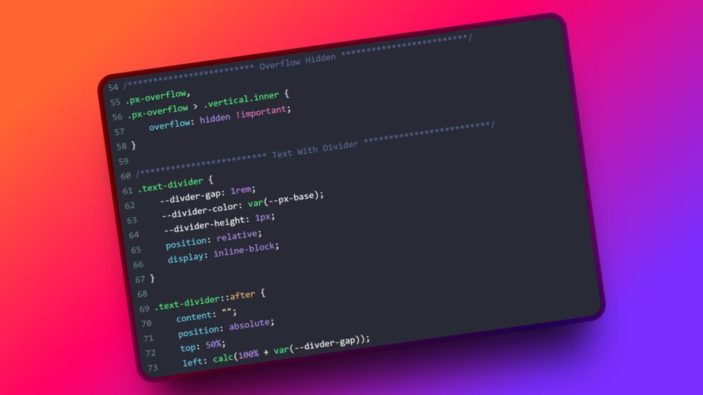
Text Dividers
In this funnel, every H2 section header comes with a slick auto-adjusting divider. No need to insert divider elements manually, just add a .text-divider class to your heading and it’ll generate the line automatically using CSS.
It’s better than adding the GHL divider element because of one-time setup, infinite reuse, divider size auto-adjusts to heading length, and Cleaner DOM, less copy-paste.
How to Use
- Add
.text-dividerclass to your heading element 👇
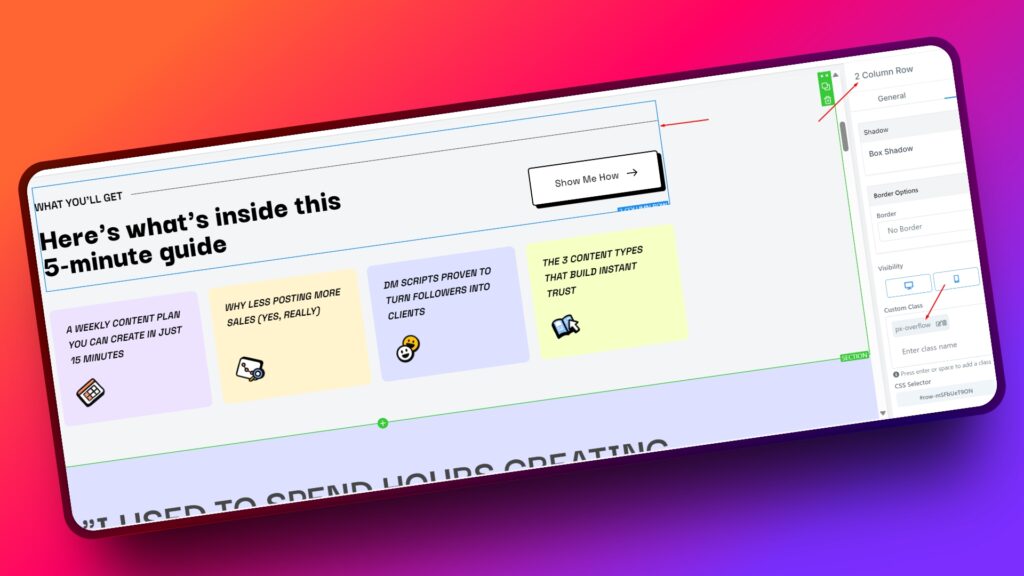
- Make sure the parent container has
.px-overflowclass
(this prevents horizontal scroll issues) 👇
If you wanna change style, you can find the CSS for this between lines 54 to 78 in your custom CSS tab 👇
Responsive Card Grid
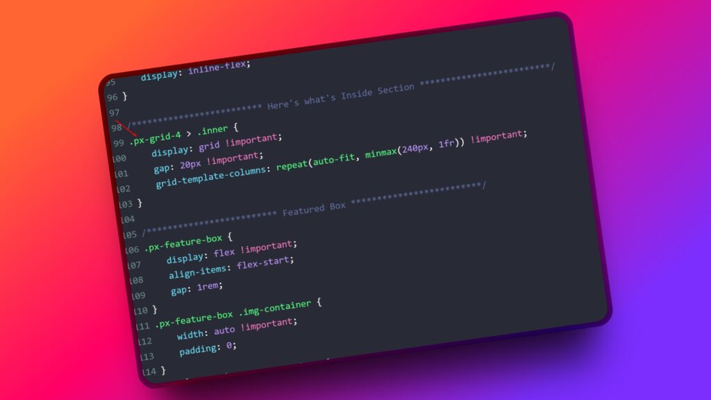
You’ll notice those nice-looking grid cards on the page, like the testimonial boxes or the feature highlights. Both those sections use a single class, .px-grid-4
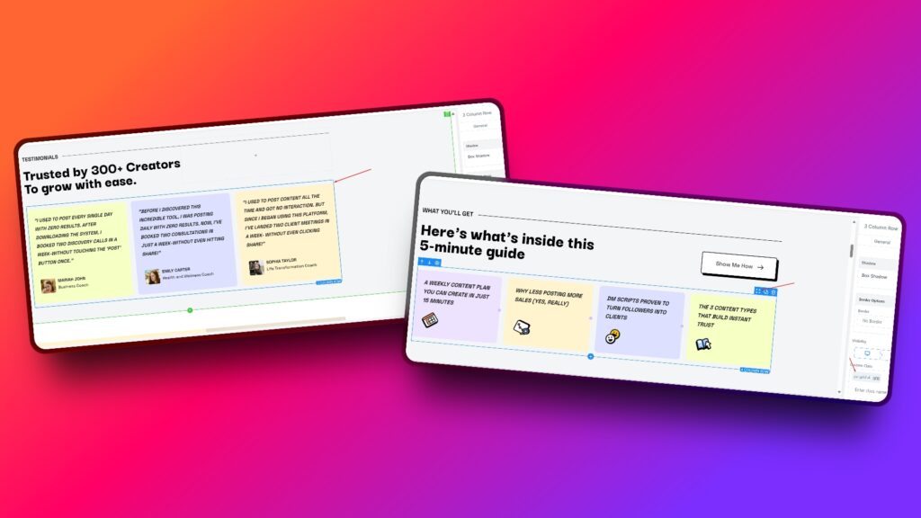
Just add this class to the column wrapper (not the individual cards) and it instantly makes the layout responsive.
What’s cool about this? You don’t need to manually tweak the direction settings for mobile in GHL. No more switching between devices and adjusting spacing on each one. This CSS takes care of it automatically, based on screen size.
The layout snaps perfectly from 4-columns to 2-columns to 1-column, all based on how wide the screen is. It keeps the spacing clean, without you doing anything extra.
You can reuse it anywhere else if you use more cards, just add .px-grid-4 to the parent container and you’re done. Simple and scalable.
Tip: Stick to 3 or 4 cards per row for the best visual balance.
You can find the CSS for this between lines 98 to 103 in your custom CSS tab
Final Wrap
This funnel uses the same styling on both the landing page and the thank you page, so you don’t need to stress about visual inconsistencies. I’ve added a few clean CSS tweaks to fix some of GHL’s default styles (you know the ones… that look a little off).
Quick heads-up: the Image Feature element in GHL isn’t great by default. And no, GHL’s settings won’t fix it. That’s why I created a custom class just for it.
Add .px-featured-box to the element and it’ll fix itself automatically. But don’t panic if it looks weird in the builder — GHL has this annoying bug where some styles don’t show inside the editor. Just hit “Preview” and you’ll see the correct result.
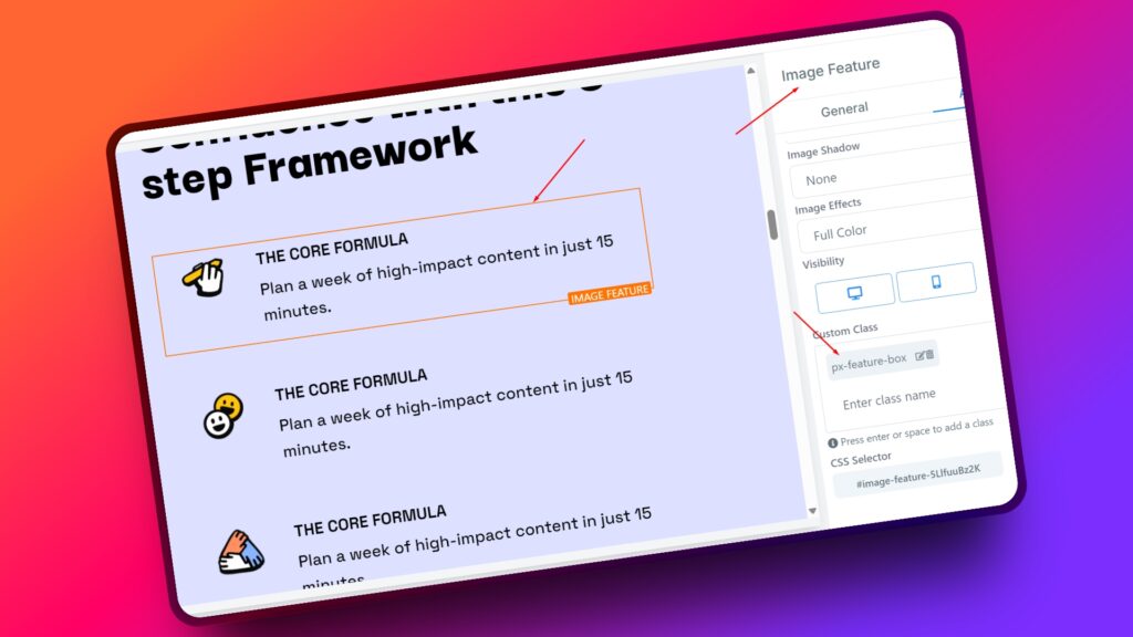
Everything else can be edited right inside the builder like usual.
Hope this doc makes it easier to style and launch faster. And if you ever get stuck, just DM me.
Cheers ✌️